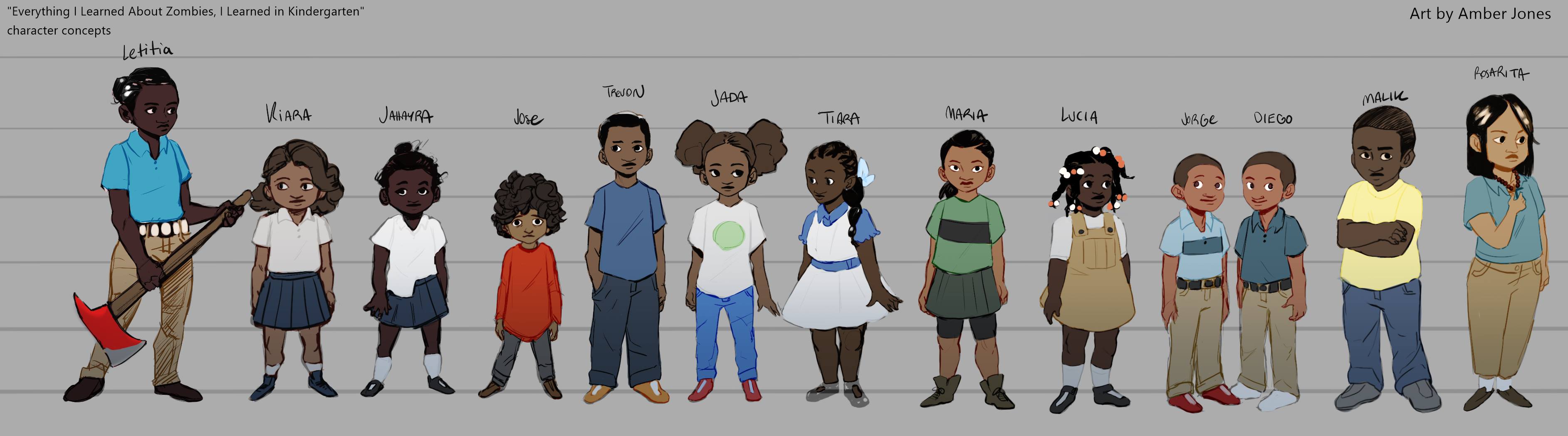
Final character designs for PS43 Survives, a proposed graphic adaptation of Everything I Know About Zombies, I Learned in Kindergarten
As I get older, I’m trying to achieve a few of those goals that I’ve wanted to achieve since I was a young man. Being obscenely wealthy seems to be out of reach, so I’m working more actively on some of the others. A couple of years ago, I got “write a novel” out of the way when I released Everything I Know About Zombies, I Learned in Kindergarten. I’m working on actually “being a novelist” now, with Bronx Apocalypse and Rosarita’s Redemption steadily approaching completion. Of course, being the kind of person that I am, “write comic books” is on the list as well. “Draw comic books” would be on the list, but, unfortunately, like “become obscenely wealthy”, that one seems unachievable.
Still, I had a dream, and I found myself working on a graphic novel adaptation of my first book whenever I got to sticking points in my next two books. Like most writers, I encounter sticking points with embarrassing frequency and, before I knew it, I had text storyboards accounting for over one hundred pages of story, based on a conventional series of 28-page comics. Getting someone to draw them was the next trick, and, unfortunately, it was a trick that was going to require money.
In searching around, I found Creators for Creators, an organization that offers $30K grants to allow previously unpublished newcomers the breathing space in their lives to create graphic novels. Not surprisingly, the submission window for that grant closed a few days ago: I’m no fool, and didn’t think that writing this piece before submissions had closed would work to my advantage. They did, however stipulate that what they were looking for was a “64 to 100 page graphic novel”, so my storyboards needed a lot of juggling. I juggled. Changed the title, too: one mistake I made with the book is that not only is Everything I Know About Zombies, I Learned in Kindergarten an unwieldy title, it gives some people the false impression that the book will be a comedy. PS43 Survives will not only fit on a cover, but I hope will fit the story better.
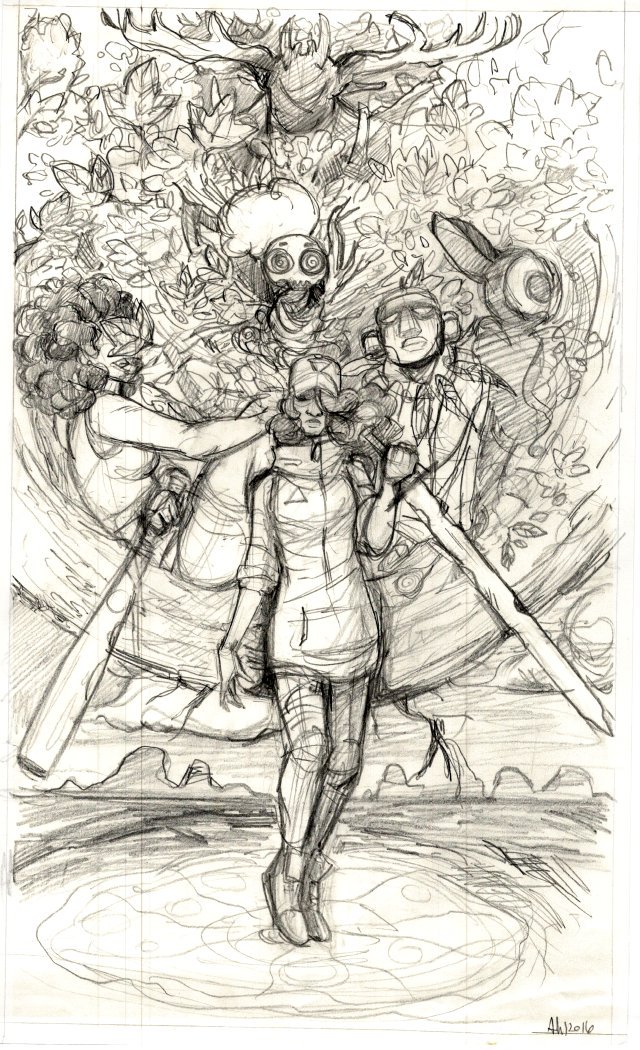
A sketch from Amber Lee Jones’s Spirit Pizza
So, story in hand, having located possible funding, I had to find an artist. After a few false starts, I found an interesting site named conceptart.org, which allows people in search of artists to post ads describing their needs. I posted an ad looking for a partner for the contest, and, while I wasn’t disappointed by volume, I was disappointed by quality. After all, one of the rules of the contest was that the artist and writer both be self-published at most, and there are reasons that an artist hangs around on art boards willing to work on spec on iffy and uncertain projects. I had nearly given up when I heard from Amber Lee Jones. Her portfolio wasn’t an exact fit, but I could see what I wanted in there somewhere, and she was willing to adapt her style to my vision. Most importantly, her reasons for hanging around art boards had nothing to do with lack of skill or talent: she has plenty of both. She’s just young, a recent graduate of the Pratt Institute in Brooklyn, still working on her path towards becoming a world-famous artist. The classic “talent trying to break in” story. You can see some of her solo work at her new Spirit Pizza page.
There was also, to me, a clear advantage in her background: as an Afro-Latina from Brooklyn, she had reasonable familiarity and understanding of my cast’s background.
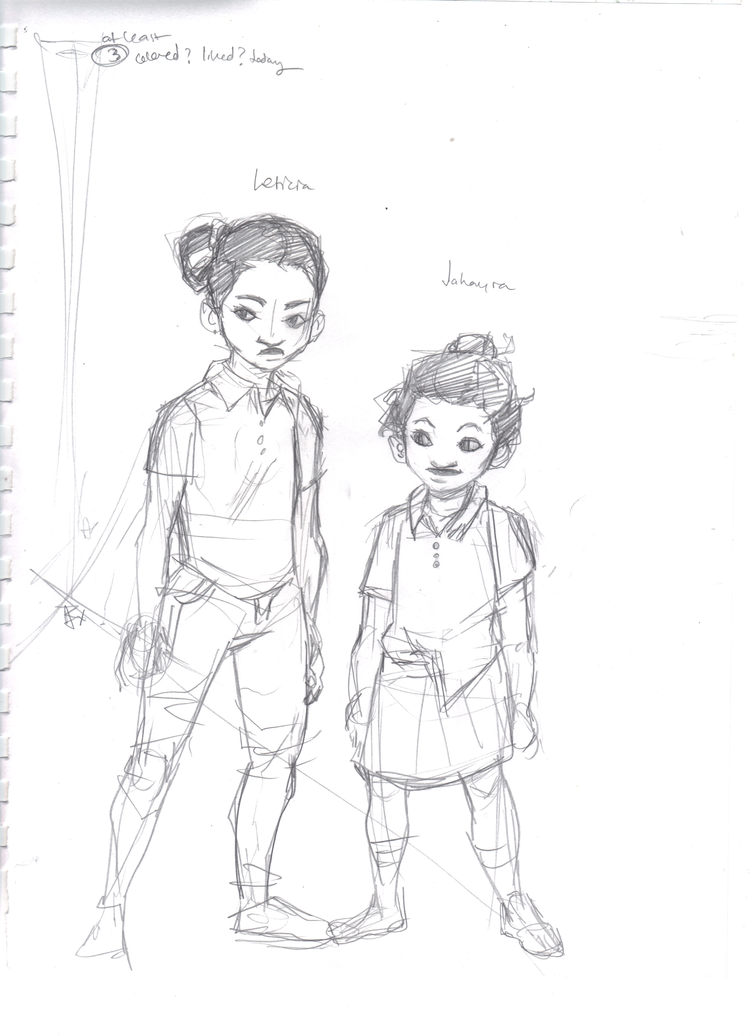
Initial character design sketch for Letitia and Jahayra
Long story short, we signed a little joint co-operation agreement and took off after the contest entry. I sent her the character descriptions, things like:
Letitia Johnson – nine (and-a-half, actually, but she never says it). 4’7″ tall, of slight build. Very dark skinned. Medium length afro, tied back into a small bun. Early in the story, Letitia acquires a fire ax, and it is her main weapon during the early chapters. It has a 36″ handle with a 5″ head, meaning that standing on the ground, it is only 14″ shorter than Letitia. The body language of Letitia wielding the ax is important to the portrayal, as Letitia is no superhero: she uses the ax because she needs to, but every swing is all she can put forth. She has to counterbalance, brace, rock with the swing, and on a few occasions she gets in trouble because the swing goes awry and she falls or the ax wedges.
Letitia is a serious child, and should not be portrayed as smiling unless specifically noted. An orphan, she suffers from the developmental problems that most orphans do: an inability to trust others and difficulty bonding. Letitia is clearly older than the rest in form: she should be drawn as six heads high or so, while the other children are about five heads high.
Jahayra Johnson – five. 3’6″ tall, similar in build and coloration to Letitia, slightly shorter fro in a smaller bun. They are full-blood sisters, and should look like it. Jahayra is irresponsible and completely dependent on Letitia. There should generally be something wrong about her appearance: bun tie about to fall off, shirt half tucked-in and half falling-out, one shoe untied, something. Not to be overdone (she isn’t a clown or comic relief), but disheveled. Generally happy in appearance (unless something terrible is happening, and sometimes even then).
She would send me back nice little sketches like the one above, and we would iterate until I was happy. This usually took only one or two passes: we only wound up in trouble with Lucia, iterating about six times before we were satisfied that we had a character that would be distinctive enough to be recognized, but still blended into crowds.
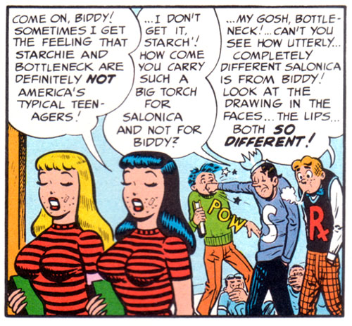
MAD satirizes Archie’s substitution of hair color for character design. (c) 1953, EC Comics
It occurred to me more than once that part of the reason that major comics studios have a tendency to whitewash things is that it’s so easy to use hair color to distinguish your characters. With twelve small children with hair ranging from dark brown to black and skin ranging from light brown to dark brown, it’s not easy to make them all distinct and realistic simultaneously. The top row picture that introduced this article shows where we wound up, with us finally settling on a “bead-and-braid” approach to give Lucia a little bit of distinctiveness.
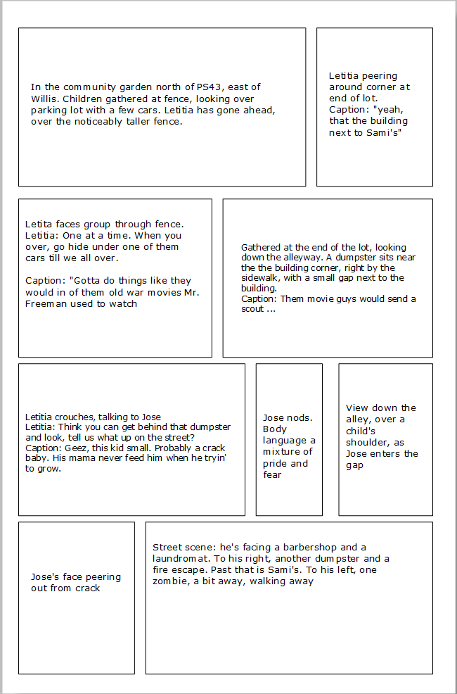
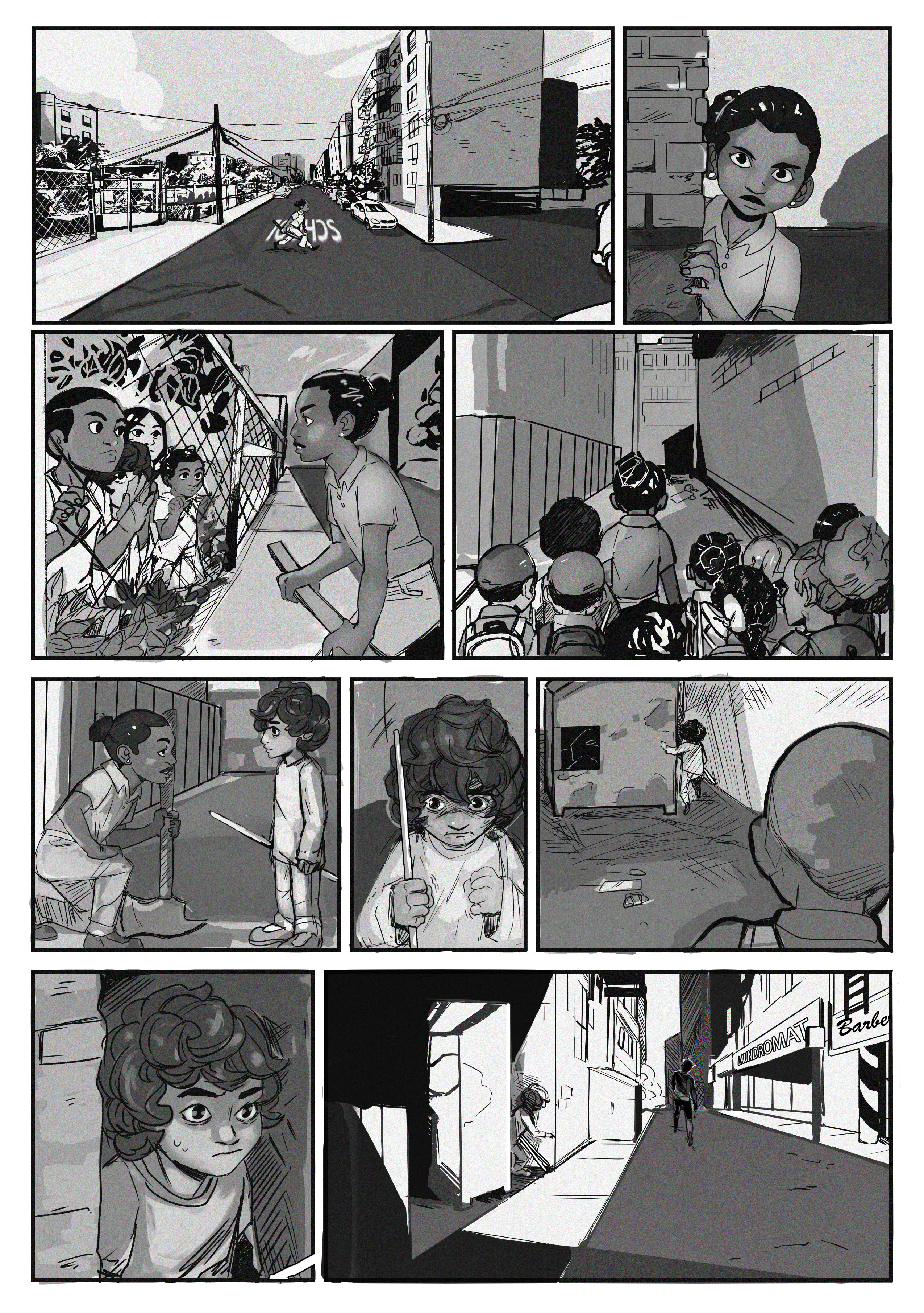
Initial Text Storyboard for a page
Once we had characters designed, we had to make them do things. Pretty pictures of kids standing still aren’t much of an attraction. Our work process is simple: I create a text story board with an approximate panel distribution on the page to set the flow and pacing of the story along with proposed dialogue and captions. Amber then sends me rough pencils, which I critique and put rough lettering on. We cycle through that once or twice, then she inks, and I do final lettering. That rough layout serves two purposes: it lets us come to an agreement as to what that text storyboard actually meant, and it gives me a canvas to refine the wording. This was my first major project where I was responsible for lettering, and you will see how I took a while to get where I was happy.
So, wish us luck: we haven’t won yet, but we haven’t lost, either. If all goes well, you’ll see a completed work someday. Wouldn’t hurt to tell Iron Circus and Image Comics how many millions of copies you would buy, either.
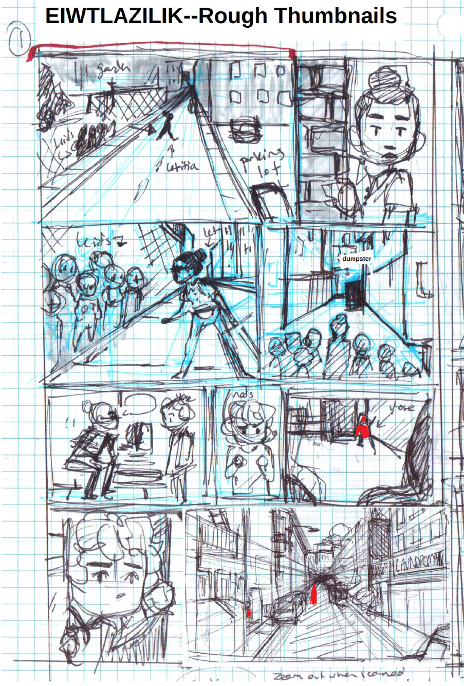
Rough Layout for the Same Page
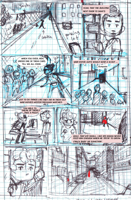
Lettering Added to check composition
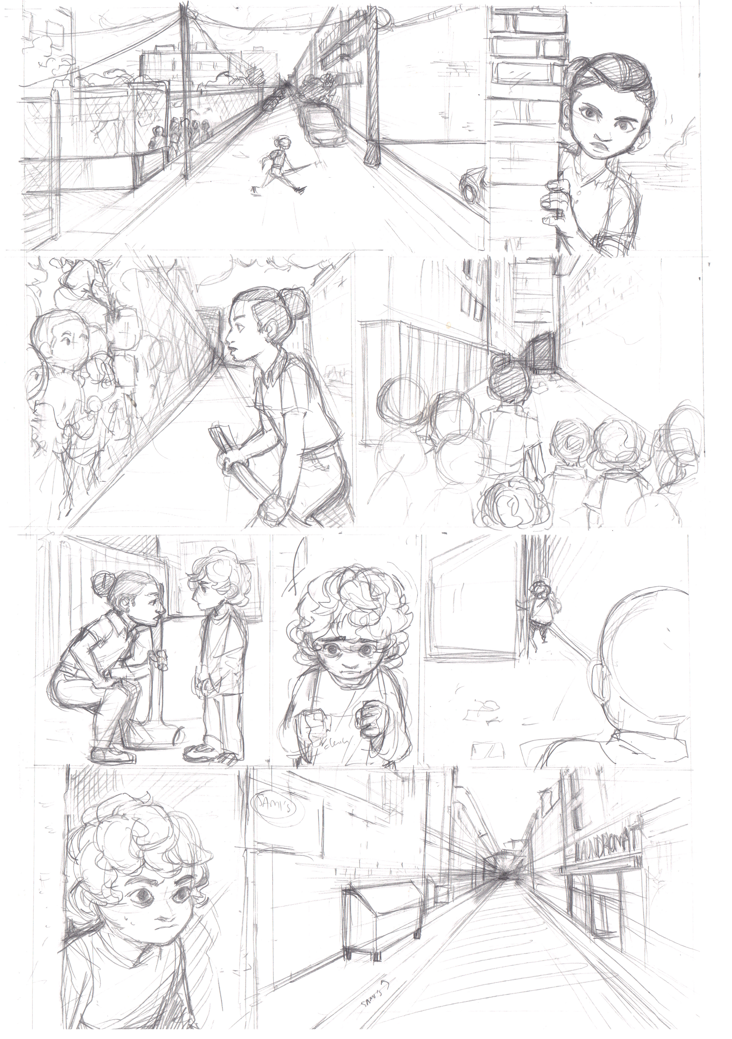
Rough Pencils

Finished pencils, relettered, plus comments
Same Page, Inked and Washed
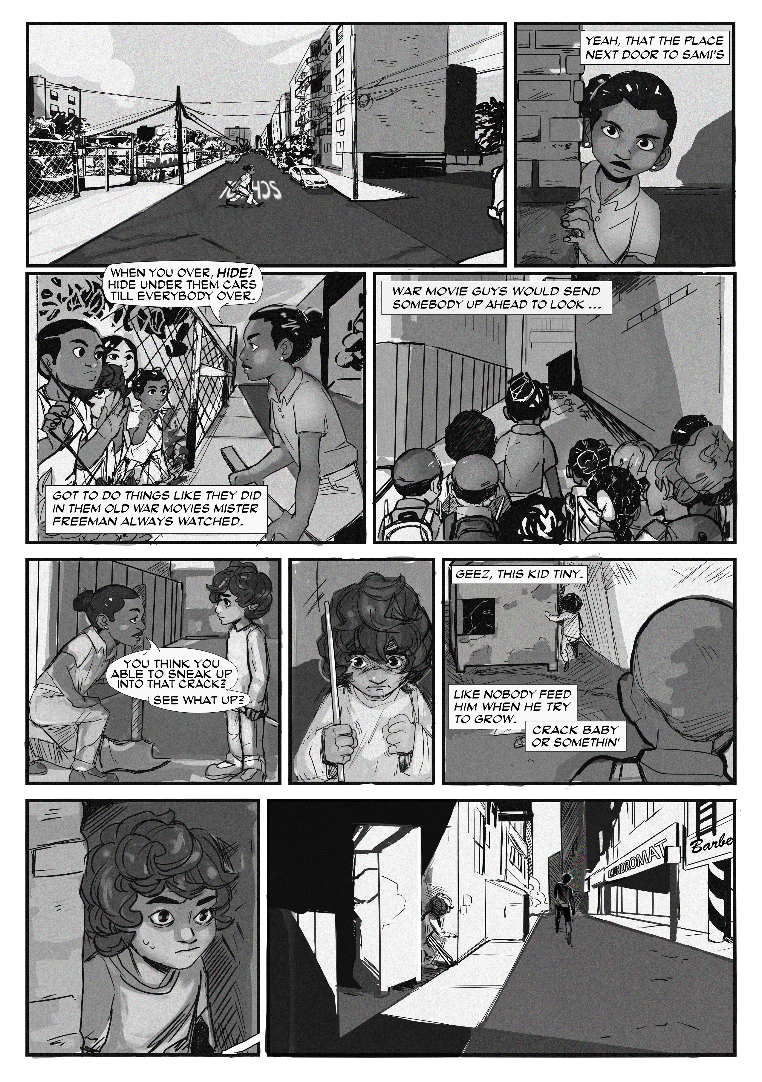
Finished page